
Making sure participants get the support in their plans
The problem
A disability support provider rostered from one system and tracked plans in another. Missed shifts showed up as unspent plan funds months later, after participants had gone without.
What the dashboard is for
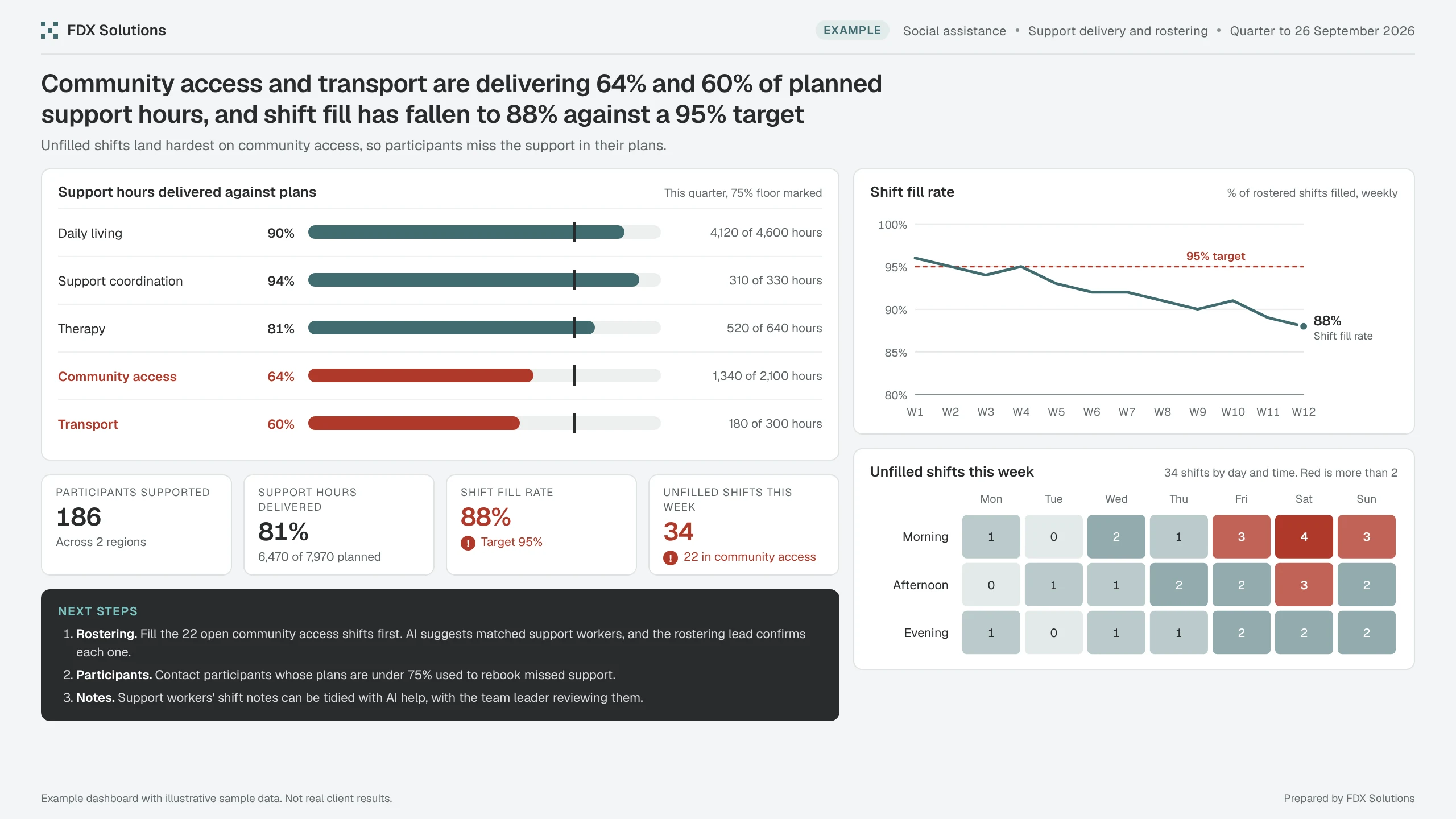
A weekly view of support hours delivered against plans, and how many shifts are filled, so rostering and team leaders can act in the same week.
What the numbers say
Unfilled shifts land hardest on community access, so participants miss the support in their plans.
- Participants supported186Across 2 regions
- Support hours delivered81%6,470 of 7,970 planned
- Shift fill rate88%Target 95%
- Unfilled shifts this week3422 in community access
How FDX uses it
Three steps, with a person in charge
Next steps it points to
- RosteringFill the 22 open community access shifts first. AI suggests matched support workers, and the rostering lead confirms each one.
- ParticipantsContact participants whose plans are under 75% used to rebook missed support.
- NotesSupport workers' shift notes can be tidied with AI help, with the team leader reviewing them.
ExampleExample case study with illustrative sample data. Not a real client or real results.
Next exampleGovernment & infrastructureOne version of the capital program everyone can trust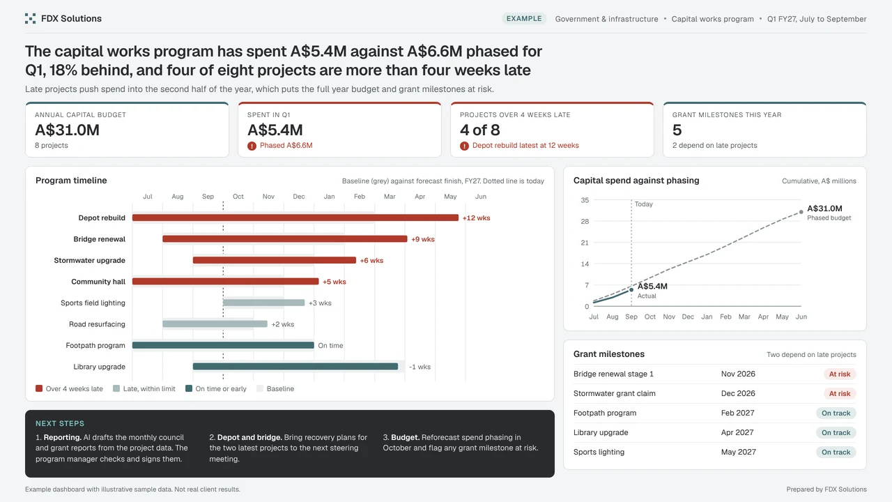
The dashboard is one part of the work.
It gives the team one trusted view of the numbers. The bigger gain is AI working from that same data to draft the follow ups, with a person approving every step.
When AI drafts from your data, personal details are masked before the model sees them. Onshore hosting is available, and your data is not used for training.